


Introduction
When it comes to printing, colour matters. Whether you’re creating a vibrant brochure or a company logo, the choice between digital and flexographic printing can make all the difference. Digital printing offers a full colour, 4-colour process, but it’s flexographic printing that brings in the versatility of both 4-colour process and spot colour printing.
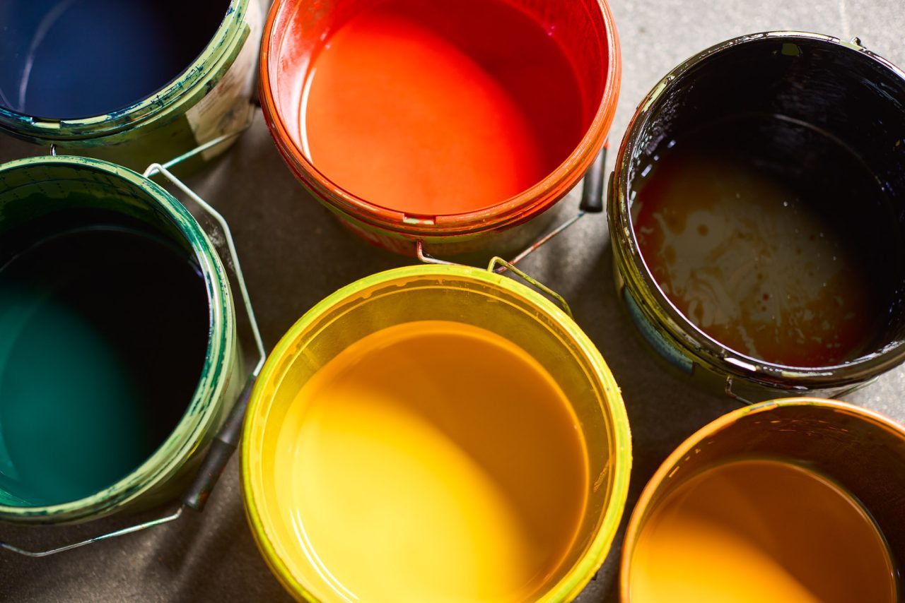
Spot colour printing, or Pantone colour as it’s also known, allows any colour to be mixed and printed separately. It’s a unique process that involves transferring the identified spot colour onto a separate plate for printing. It’s not unusual to see a process colour print job needing an additional dash of spot colour to bring that extra oomph.
So, if you’re keen on learning more about the intricacies of spot colour printing and how it can enhance your printed materials, you’re in the right place. Let’s dive into the colourful world of printing.
Understanding Spot Colour Printing
The art of spot colour printing, often recognised as Pantone colour in the world of print, is a technique that allows for a distinct and sharp colour production. Unlike process colours, based on the CMYK model (Cyan, Magenta, Yellow, Black), spot colours are mixed inks that ensure uniformity and precision in colour reproduction.
Spot colours prove beneficial in scenarios where colour consistency is paramount, for instance, in producing cohesive brand identities. A company’s logo often employs spot colours to maintain uniformity, given the visual brand identity heavily influences overall brand perception. Indeed, spot colours stand vital in printing materials in various parts of the world, ensuring colour precision and consistency.
In the realm of Spot Colour printing, a name worth noting might be Cadbury’s, a brand that employs a specific shade of purple to enhance its brand recognition. The importance of this specific “Cadbury purple” underlines the role spot colours can play in reinforcing a brand’s identity.
Moreover, spot colour printing extends its application beyond conventional paper printing. In contemporary printing scenarios, spot colours play a crucial part in producing accessories like screen printed T-shirts. Such applications require artwork files containing spot colours to guarantee consistency and vibrancy.
Grasping spot colour printing could significantly impact your project’s quality and appearance. The proper use of spot colours assures brand consistency. The application of this printing method depends on your project requirements, budget, and the necessity of precise colour reproduction.
Comparing Spot Colour and Process Colour
To understand how spot colour creates a subtle yet significant difference, let’s contrast it with process colour. In process colour printing, CMYK inks are used to create the entire spectrum of colours. The precision of this method is evident in a typical newspaper; its print style amplifies the “moire pattern,” where small, repeating dots of CMYK ink build up to form comprehensive colours, as clearly seen in the second close-up image.
Yet, process colour can create vibrant, beautiful hues, though they may not be as accurate as the colours produced by spot colour. Suppose your brand colour is a specific shade, like the iconic Cadbury Purple. In that case, only spot colour can faithfully reproduce it, making it a clear winner in the spot colour vs process colour debate.
Creating effects adds an extra dimension to a finished print product, and here, too, spot colour takes the lead. For instance, if you’re seeking to create a metallic effect using metallic ink, process colour can’t deliver the goods, whereas spot colour just might.
Further comparing the two, opportunities to cut costs becomes apparent. For instance, using spot colours when printing a green and black label reduces the number of inks, making it cheaper than printing with process colours.
Though both have their merits, spot colour offers more vivacity and precision, thus standing out in its colour reproduction capabilities.
When to use spot colours
Spot colour printing undeniably brings a host of advantages to the table, offering unmatched precision, vibrancy, and versatility. Accuracy is one of its greatest appeals. Unique colours, such as those assigned by the Pantone Matching System (PMS), guarantee perfect colour reproduction. So, rest assured, that Cadbury’s purple on your artwork will come out just as you envisage. Another edge spot colours have over their counterparts is their ability to produce special effects like metallic finishes, adding an extra touch of creativity to your project.
Parallelly, spot colours can significantly cut down on plates and the number of colours, making for an economical choice for your printing needs, especially when dealing with limited colour artwork. For example, printing a logo that uses three specific colours is cheaper and faster with Spot colours, as it requires just three plates, as opposed to four plates needed in four-colour process printing.
On the flip side, it’s essential to remember that while Spot colours dazzle with accuracy, they come with a few inconveniences. The biggest one is cost. While limit-colour jobs might prove cheaper, for more intricate designs necessitating numerous unique colours, Spot colour printing could very well break the bank. This issue arises because Spot colours demand a unique printing plate for each colour, increasing the total cost.
Another hitch is the preparation time. Spot colour printing necessitates a comprehensive cleaning of the machine before and after applying each Spot colour to prevent colour contamination. This results in increased production times, causing an additional surge in costs compared to standard CMYK printing, where four channels are continually set with the same colours.
To sum it up – Spot colour printing is the way to go when accuracy is key, be it for brand consistency or when printing on a specific material like metallic finishes. However, the monetary and time costs involved may deter those working with complex designs. Make sure to weigh these factors carefully before making your final decision.
Using Special Colours: A Close Look at Pantone and HKS
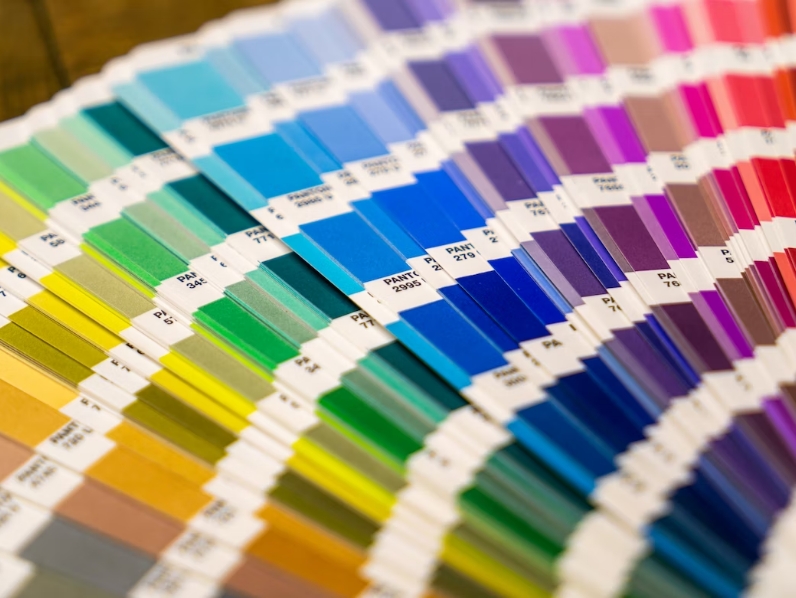
Before diving into the specifics, it’s vital to understand that Pantone and HKS are renowned colour systems used worldwide. They are synonymous with exceptional precision, enabling a spot-on match for brand identities or particular colour requirements.
Pantone, a proprietary colour system, boasts a vast catalogue of over 1,800 colours. The Pantone Matching System provides the industry with precision by standardising colours, crucial in ensuring brand identities are accurately reproduced across various mediums. Take, for example, the specific red used in Coca-Cola branding. It’s Pantone 485, a unique formulation that ensures consistency, whether displayed on a billboard or a business card.
The HKS colour system, although lesser-known compared to Pantone, holds its ground firmly in specific markets – primarily in Europe. The system comprises approximately 120 spot colours and 3,250 tones, for coated and uncoated papers. For instance, if one requires an explicit shade of yellow for their company logo, the HKS system offers specialised colour matching that’s second to none.
Employing these special colours, whether Pantone or HKS, is particularly beneficial when a job requires exact colour matching that CMYK processes might not deliver. HP IndiChrome, an onsite mixing system, illustrates this perfectly. It uses a combination of 11 base colours to create a specific spot colour, offering unmatched precision and versatility. Thus, irrespective of the media, brand colours are reproduced faithfully, echoing vibrancy and consistency.
However, it’s key to remember that these processes, whilst precise, may incur higher costs. Specifically, using these special colour systems entails creating unique printing plates for each colour, elevating both time and monetary expenses. So, while these systems are paramount for accuracy and brand consistency, one must factor in the potential increased expenditures. After all, the best results often demand an extra degree of craft.
Practical Application of Spot Colours
Spot colours find their most valuable use in a variety of cases where precision or a specific finish is required. Predominantly, businesses use spot colours for key elements such as logos and branding materials, where the reproduction of the exact colour is vital for brand identity consistency.
When using digital artwork, spot colours bring boldness and vibrancy to the final printed product. This boldness has particular relevance in poster or banner production, where catching attention is prime. For example, a business might employ a flashy Neon Pantone for a promotional banner, ensuring the colour stands straight out even from a distance.
Commercial printers often prefer spot colours for jobs involving two or fewer colours. Examples might include business cards, labels, or leaflets where only one or two colours are used alongside black. It proves more cost-effective to run these fewer colours as spot colours rather than the full CMYK process setup.
Another significant use of spot colours lies in jobs where metallic or fluorescent colours are needed. Here’s a quick fact: ordinary CMYK cannot recreate such colours. Your company might need to print annual reports with metallic gold highlights. In this case, spot colour usage helps achieve the desired effect.
Spot colours also serve well on different substrates or materials. Substrates that are not typically white can be challenging for CMYK printing due to their dependence on a white base for colour accuracy. On the other hand, spot colours, especially those from the Pantone Matching System, overcomes this challenge, maintaining colour fidelity regardless of the material colour.
Implementing Spot Colour Artwork Set-Up
Adopting spot colour set-up for your art projects involves a meticulous process. The first step entails determining the precise colour, taking advantage of Pantone Matching System (PMS) or HKS for uniformity and standardisation. For instance, Pantone provides reference numbers, making it easier for designers and print houses to reproduce the exact shade, enhancing vibrant results irrespective of geographical locations.
Next, in implementing the spot colour set-up, it’s essential to consider what you’re printing on. Spot colours yield superior results when used on varied substrates. From fabric to plastic, their flexibility ensures that the inherent vibrancy isn’t lost when used on different surfaces. For example, in screen printing, a mesh screen coated with spot colour ink contacts the surface, imprinting the exact hue.
Following the actual printing process, careful inspection and quality control processes are vital. These checks ensure the colours reflect your brand accurately, mirroring on-screen instructions accurately. Rigorous evaluation of the printed materials mitigates the risk of colour disparities between the original digital artwork and the final product, granting you more control over your brand’s appearance in various media.
However, let’s not forget that adopting spot colour printing might increase the cost of your project. Due to the unique printing plates involved in spot colour set-ups, printers may charge you more compared to other methods. Yet, the higher costs often prove worthwhile, given the impressive colour reproduction and consistency the spot colour process offers.
Transitioning towards spot colour printing is a significant decision. It’s a commitment that promises improved accuracy and vibrancy, reinforcing your brand identity across all platforms. By considering factors like the nature of your project, material substrates, and budget constraints, spot colour set-ups might be what you need to propel your brand to new heights of recognisability and aesthetic appeal.
Verifying Spot Colours: Essential Steps to Follow
1. Ensure Homogenous Mixing of Inks
After the decision to implement spot colour printing, there are crucial steps to follow in verifying them. Initially, it’s crucial to ensure a homogeneous mixing of inks. The Pantone Matching System (PMS) acts as a baseline, with its specified recipes guaranteeing a repeatable mix. For instance, PMS 185C, a shade of red, comprises 16 parts Warm Red and 1 part Rubine Red according to the recipe.
2. Test On A Sample
Secondly, apply the mixed inks to a sample substrate. Test prints provide first-hand visual adaptations of how the colour appears on the desired substrate, whether it’s paper, fabric, or plastic. For example, PMS 2326C, a rich brown, would potentially deepen when printed on a tan-coloured fabric.
3. Compare Against Pantone Colour Swatch
Thirdly, compare the test print against a Pantone colour swatch in a condition of proper lighting. Pantone recommends D50 lighting, equivalent to a midday sun, to evaluate colours accurately. For instance, in D50 lighting, PMS 376C, a bright green, would display its true vibrant hue, contrasting to an indoor fluorescent light where it might seem duller.
4. Make Adjustments
Fourthly, address any variance. If the test print displays a colour slightly off from the Pantone swatch, adjustments in the mixing ratios need reiteration. For instance, if PMS 1595C seemed too murky, the printer might need to reduce the proportion of Black in the mix.
5. Make Detailed Notes
Lastly, always document the mixing ratios, substrates used, and steps taken for replication or refinements in the future. In essence, verifying spot colours facilitates accurate colour reproduction, ensuring that your designs manifest in high-quality, vibrant prints. Be aware though, it may incur additional costs due to specialised processes.
Conclusion
So, there you have it. Spot colour printing has its distinct advantages and challenges. It’s a technique that can truly make your visuals pop, offering precision, vibrancy and brand consistency. Yes, there’s a cost implication due to unique printing plates, but the result is an accurate colour reproduction that’s hard to beat. Whether it’s for logos, branding materials, digital artwork or poster production, spot colours can make a world of difference. The key is in the details – meticulous ink mixing, testing, comparing, adjusting and documenting. It’s a process that demands attention but rewards you with high-quality, vibrant prints. Spot colour printing might not be for everyone, but for those who value precision and consistency in their prints, it’s well worth considering.
Frequently Asked Questions
- Spot colours ensure precise and vibrant colour output, thus sustaining consistency across all branding materials. This method is ideal for logos, digital art, and posters, and can be applied to various substrates, including fabric or plastic.